Branding
Joy Gbasouzor Logo
Project details
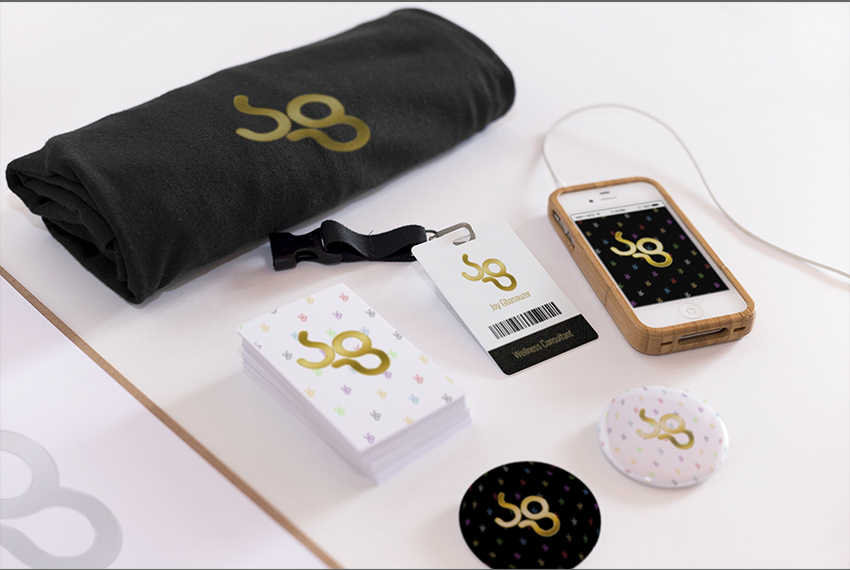
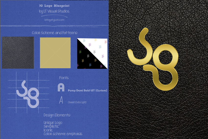
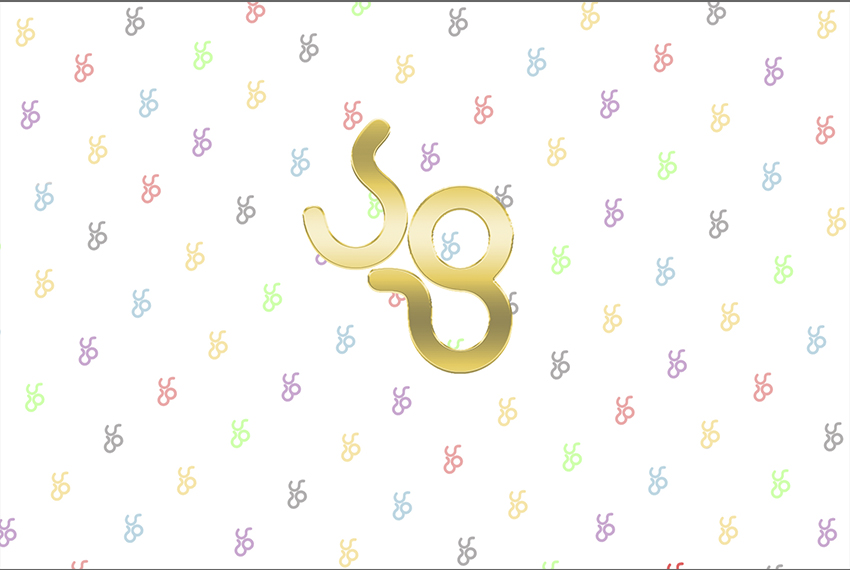
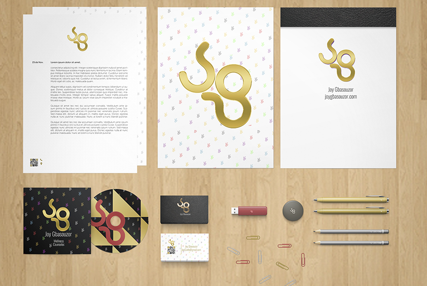
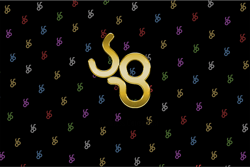
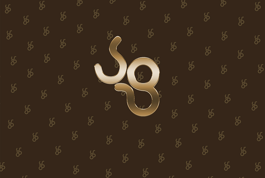
The main goal in development was to create a unique though simple logo, that could become a recognized brand. That is why I opted for a center logo, and negative space in terms of style. This allowed me to combine three conceptions in one symbol. After a number of variations, the solution was found by using unique variations of the letters J and G. After that, the dominant color palette of the whole corporate identity had to be chosen. We decided on using gold and black as the main theme colors, which gives the brand a feeling of sleekness and luxury. We also decided to use smaller variations of the logo repeated, as a play on the style found in high end designer brands. This was a perfect fit not only for the client, who personally values and embodies these qualities, but also her business, which is Wellness Consulting.
-
Category :
Branding
-
Client :
Joy Gbasouzor